O
ver the years, there have been various theories about how we perceive colour.
For centuries the widely accepted scientific theory was that there must be three types of receptor in the eye, one responsive to red light, one to green, and one to blue. This theory emanated from the observations recorded by Isaac Newton in the late seventeeth century, that sunlight that is shone through a prism splits out into three colour beams, one of a red colour, one green and one blue, and that beams of just these three colours when shone overlapping onto a white surface in different combinations and levels of brightness can produce pretty well the whole range of colours that we can give a name to.
From medical dissection of the eye and so far as anyone can tell it seems that there are receptors (cones) in the eye that respond to different wavelengths, but this precise red, green, blue split is far too rigid in reality, and the analysis of these signals by the brain more complex, see David H. Hubel, Eye, Brain and Vision, (1988).
Hubel has a chapter on colour vision in which, because his findings are only rather nebulously in accordance with the academic wisdom that had pertained for centuries, he pussyfoots around a little. He freely admits that research by the time he wrote the book left many questions unanswered, one thing that had become very clear though was that colour perception is relative, not absolute. Colour vision is not meachanical, the eye isn’t a kind of fleshy camera, there are lots of things going on when we visially perceive something.
I come at this not so much as a scientist, I’m not that interested in the morphology of the eye, more from what colour is doing for us visually, more I suppose from the standpoint of an artist.
This approach could be said to be more in line with the way J. W. von Goethe came at it in his
Theory of Colours in 1810, a delightfully nutty book to read, but technology has come on a long way since then, we now can take much more scientific approach as the tools are available to do that. That is where I am coming from with my varifold experiments.
N
o one really understands how the eye perceives colour. Whatever the answer is, one thing is sure, it isn’t mechanical; the eye, or eye and brain as a unit, does not work like a colour film or digital camera.
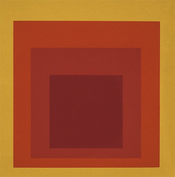
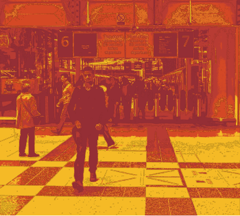
In the two images below, the same four hues are used in each at almost the same levels of saturation and brightness. The first is an approximation to a Homage to the Square painting by Josef Albers and the second is a photo that I have processed to have the same colours as the Albers painting, though I have brought up in brightness by twenty per cent because in their strict transcription the photo image would be even darker and muddier than it is, colours on the processed photo are in equal proportions based upon the brightness of the pixels in the photo. They are the same colours – give or take a bit of brightness level – in both, but the visual impression is very different. Hue is clearly of secondary, one could say minor, importance.


I
n the nineteenth century some scientists, James Clerk Maxwell being a notable example, had the idea that if you filmed the same scene onto black-and-white light-sensitive transparency (the only sort available at the time), with one camera through a red filter, a second camera through a green filter, and a third through a blue filter, and then projected a white light through these transparencies synchronised through their respective colour filters, you’d get a full-colour photographic image appearing on the surface the light was being projected onto. That was a bright idea because so you do, but the technology of the time made this triple-synchronisation tricky and unsatisfactory.
Some found, however, that using just two cameras and two filters, one red and the other green, you still get close to full colour, i.e. you get blue too, just from red and green. This technique was developed by a number of people, notably Claude Friese-Greene in the early decades of the twentieth century, some of the movie films he made using red and green filters can be seen on YouTube, e.g.
London Bridge 1926. Early cinema colour movies, for example those using the Technicolor process, used essentially the same technique, using light splitters rather than two cameras.
In the 1950s Edwin H. Land began to do academic experiments on this phenomenon, as explained in his 1959 paper
Experiments in Color Vision. Land discovered rather by accident that if the green projection filter be removed the resulting image was, though rather washed out, still in full colour. How? How is it that the eye is perceiving full colour, from a projection that is only shades of red and grey? This phenomenon is called colour constancy and has never really been explained. I have a hypothesis as to why, which you can read in the writeup on my page
Equivalent Colour Brightnesses. That is however a theory based upon conjecture, as so many are, though I think has some observational credibility about it.
Examples of colour constancy – quite striking examples – can be see on my pages
Colour Constancy,
Colour Constancy Overlays and
Simulated Colour Filters.
Whatever is going on is obviously of significance when choosing colours for visual presentation, and especially so if that choice is being made mechanically, as increasingly it is likely to be. Relative brightness plays a significant part – that is the brightness of an area in relation to the areas around it, not its absolute brightness so much as that can change with the ambient light, more how it relates to nearby shapes, and the other aspect that has great significance to this is size of an area.
My researches and experiments are primarily around this topic of colour perception in the spiritual sense (as opposed to the mechanical) and of colour constancy and its role in this.
Always happy to discuss. Email me via the Contact link in the menu bar or by clicking
here.
***

