T
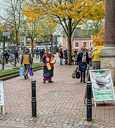
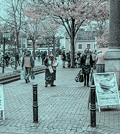
he first of these two photos is in full colour, the second is the same photo converted to just shades of grey and of cyan. There is no pink in the second picture, or rather there isn’t if you look at the pixels with a colour meter (e.g. the Digital Color Meter that comes free with latest versions of Mac OS). If your eye sees pink, as most people’s will, it is seeing a colour that is technically neutral grey, the areas that are being perceived as pink or magenta are, on the original, areas coloured yellow, orange, light red (i.e. pink) or magenta that have been converted to neutral grey, in other words have been converted to various intensities of black.
To reiterate, since it can be hard to believe, the second photo is solely shades of blue and neutral grey.
Further examination of this photo converted to the print process colours Cyan, Magenta, Yellow and Black can be seen on my Flickr photostream:
Colour Constancy Cyan,
Colour Constancy Magenta and
More Colour Constancy.
A
detail from
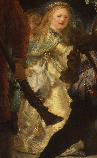
The Night Watch by Rembrandt in the Rijksmuseum, Amsterdam. The blue colour on the shawl of the young woman and the dress of the woman behind her are not, looked at with a colour meter, blue, but grey-green, looked at in isolation you would say more grey than green. This kind of colour:
The blue-appearing colour is not a flat colour, each pixel is a different shade, the sample square that I have given being just one of them, but if you look at the blue-appearing areas with a colour meter you will see that all the pixels are a shade of grey-green, not blue. This is an example of colour constancy being used in a painting by an old master, whether he was aware of the technical implications of what he was doing here, we don’t know.
Clearly artists have been taking advantage of this phenomenon for centuries, often no doubt just intuitively. I don’t exactly know how to make use of this systematically when making pictures, though if technical aids to design are to develop as I am sure they must then that hole in my knowledge knowledge should I hope be just temporary.
M
y third example is of colour constancy effects using monochrome grey, red and green. This is an interactive demo that can be seen on my page
Colour Constancy Overlays.
***
The background to this page may be seen on my pages
Colour Constancy Intro and
Experiments with Colour.


